solana-wallet-ui-branded
A customizable Solana wallet UI kit for React, providing full control over wallet adapter components and themes. Built with TailwindCSS, DaisyUI, and Solana wallet adapters.
Solana Wallet UI Branded
Take full control over your Solana wallet UI components. This repo demonstrates how to style the wallet adapter while maintaining clean separation of concerns.
Overview
Instead of wrestling with the default Solana wallet UI styles buried in node_modules, this implementation provides direct control over every component. Includes several theme presets demonstrating the styling possibilities.
Using This Repository
There are three ways to use this codebase:
Option 1: Quick Start with create-solana-dapp
The fastest way to get started:
npx create-solana-dapp@latest --template nothingdao/solana-wallet-ui-branded
This will create a new project with all dependencies installed and ready to run.
Made possible by the excellent work from:
Option 2: Clone and Run
If you want to run this repo directly:
- Clone the repository:
git clone https://github.com/nothingdao/solana-wallet-ui-branded
cd solana-wallet-ui-branded
- Install dependencies:
npm install
- Start the development server:
npm run dev
Option 3: Implementing in Your Existing Project
To integrate these components into your project:
- Install required dependencies:
npm install @solana/web3.js @solana/wallet-adapter-react @solana/wallet-adapter-wallets
- Copy the core components from
src/components:
- WalletContext.tsx
- WalletConnection.tsx
- WalletModal.tsx
- StyleContext.tsx (optional - for theme support)
- StyleSwitcher.tsx (optional - for theme support)
- Set up the providers in your app:
import { WalletContextProvider } from './components/WalletContext'
import { StyleProvider } from './components/StyleContext' // optional

function App() {
  return (
    <StyleProvider>
      <WalletContextProvider>
        <YourApp />
      </WalletContextProvider>
    </StyleProvider>
  )
}
Components
WalletConnection.tsx
- Main connection button
- Shows "Connect Wallet" or truncated address
- Manages dropdown menu when connected
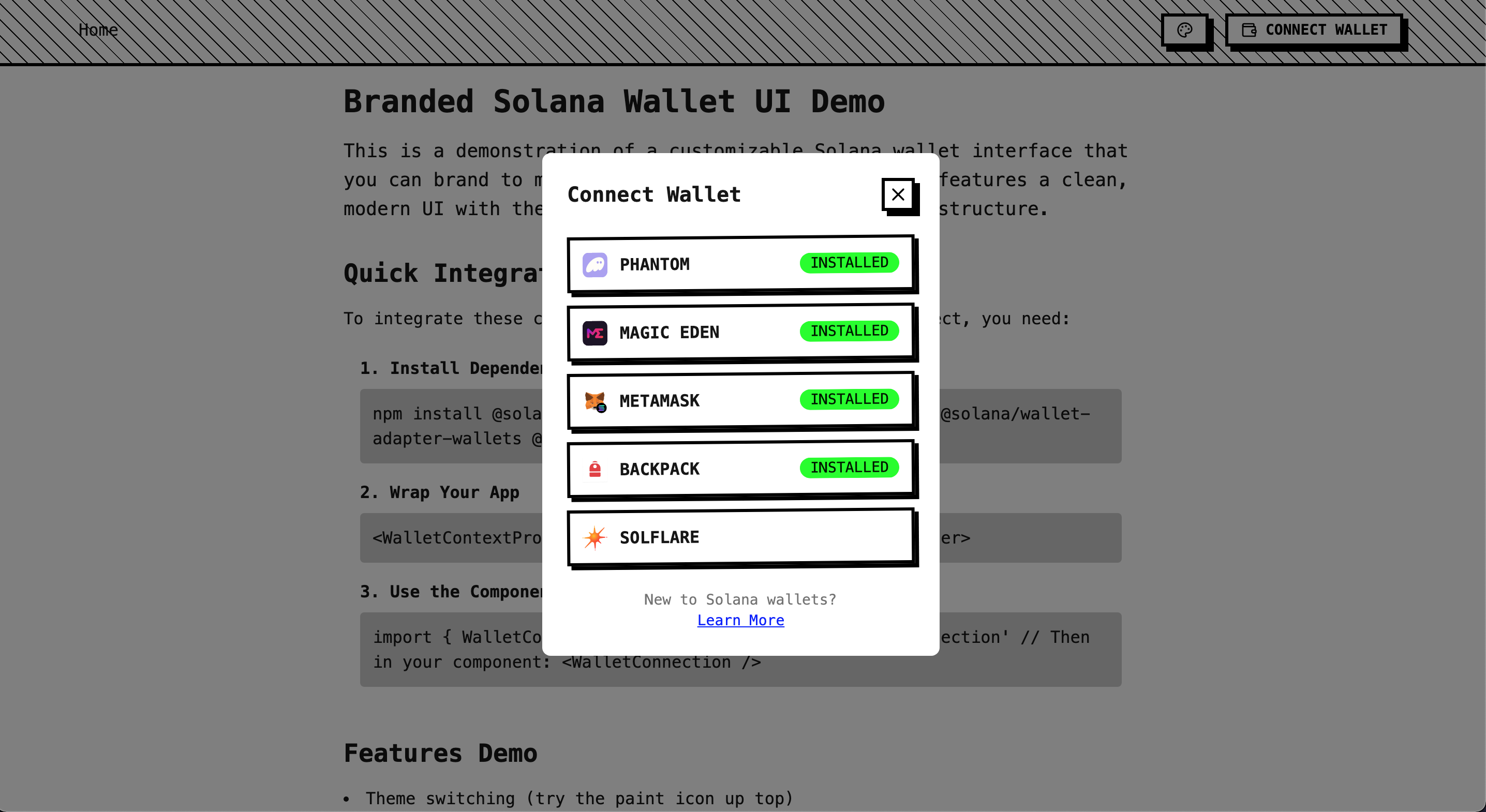
WalletModal.tsx
- Wallet selection modal
- Lists available wallets
- Shows installation status
WalletContext.tsx
- Sets up wallet providers
- Configures network connection
- Manages available wallets
Style Components (Optional)
- StyleContext.tsx: Theme state management
- StyleSwitcher.tsx: Theme preset selection
Theme Showcase
The demo includes five distinct themes showing the styling possibilities:
Corporate
Professional design with clean lines and subtle shadows.
Cyberpunk
Neon gradients, glowing effects, and dark contrasts.
Minimal
Black and white, clean typography, no decorative elements.
Playful
Soft shadows, rounded corners, friendly animations.
Brutalist
Raw HTML aesthetic with aggressive styling.
Styling System
The demo uses Tailwind CSS and DaisyUI but works with any styling approach:
// With CSS Modules
<button className={styles.walletButton}>

// With styled-components
const WalletButton = styled.button`
  your-styles-here
`

// With plain CSS
<button className="wallet-button">
Customization
Wallet Adapters
const wallets = [
  new PhantomWalletAdapter(),
  new SolflareWalletAdapter(),
  // Add more wallets
]
Network Configuration
const endpoint = clusterApiUrl('mainnet-beta')
Behavior
- Auto-connect settings
- Address display format
- Modal animations
- Theme persistence
Contributing
Contributions welcome! Please feel free to submit a Pull Request.
License
MIT License - use freely in your own projects.